
Quiz Monkey
What do you want to know?
|
|
Quiz Monkey |
| General |
| Colours |
| Colour details |
| Paints |
| Light |
| Printing |
| Complementary Colours |
| Additive and Subtractive Mixing |
| Illustration |
If you like my website, and/or if you've found it useful, please consider making a small donation to my Just Giving page, which I've set up just for this purpose. To begin with I'm collecting for a charity whose work I have benefitted from myself (and continue to do so): the British Heart Foundation. It would be great to raise £100 in the first month.
If you have already donated ... Thank You!
When Isaac Newton discovered that sunlight was made up of light of various colours, he identified seven primary colours: red, orange, yellow, green, blue, indigo and violet. Later scientists reduced the number of primary colours to three – red, yellow and blue – but the Scottish scientist James Clerk Maxwell, working in the mid–19th century, proposed that the three primary colours were in fact red, green and blue.
Maxwell discovered that the human eye reacts differently to light of these three colours. In the human eye there are three kinds of colour receptors: some that react to red light, some that react to blue, and some that react to green. The light that enters our eyes comes in an infinite variety of different colours and shades; but the colours that we see depend on the amount of red, blue and green it contains. The stronger the red component, the more the red receptors react; and similarly for the blue and green. Our brains combine the three colours to make up the infinite variety of colours in the light that enters our eyes.
It may be different these days, but in my day we were taught at primary school that the three primary colours are red, yellow and blue.
 This is because these are the best colours to start from if you want to mix paints to make other colours. Red and yellow make orange; yellow and
blue make green; red and blue make purple. And if you mix all three primary colours together in equal proportions, you get something that's
pretty close to black.
This is because these are the best colours to start from if you want to mix paints to make other colours. Red and yellow make orange; yellow and
blue make green; red and blue make purple. And if you mix all three primary colours together in equal proportions, you get something that's
pretty close to black.
This makes sense if we think about the rainbow: where red and yellow merge, we get orange; and where yellow and blue merge, we get green.
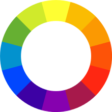
But to understand how red and blue make purple, we have to take a step beyond the rainbow (figuratively speaking – everyone knows that you can't actually get to a rainbow really) and think of the colours as being in a wheel, where the red and blue extremities of the rainbow meet to make purple. (I'm not sure how this works scientifically – although it does seem to make some sort of sense intuitively ...)
To summarise, here are two very simple tables:
| Primary colours in paint | Red, Yellow, Blue |
| Secondary colours (in paint) | Made by mixing |
| Orange | Red and yellow |
| Green | Blue and yellow |
| Purple | Red and blue |
We can now forget about paints (more or less).
When you go to secondary school and study physics, you learn that for light, the three primary colours are red, green and blue. (This backs up what we saw above, about James Clark Maxwell and the three different types of receptors in the human eye.) Red and green – which with paints just make a mess – make yellow; green and blue make a colour that's a bit like turquoise, but which the scientists call cyan; red and blue make a sort of pinky–purply colour, which the scientists call magenta. If you mix all three (red, green and blue) together, in the right proportions, you get white.
| Primary colours in light | Red, Green, Blue |
Colour televisions, and computer screens, work on this principle. They have a matrix of pixels, in clusters of three; and in each cluster there's one pixel that shows red, one that shows green and one that shows blue. To show yellow, they light up the red and green pixels; to show cyan, they light the blue and green pixels; and to show magennta, they light the red and blue pixels.
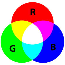 To show white, they show all three colours – red, green and blue.
Figure 2 illustrates this.
To show black, all three pixels are unlit.
Of course, what we see in real life has more than just these eight colours (red, green, blue, yellow, cyan, magenta, white and black). There are various shades of each (not forgetting grey, which is a combination of black and white), and there are other colours such as orange and brown that we haven't even considered.
But each of these millions of other colours or shades is made up from just the three primary colours: red, green and blue. The variation comes from the relative intensity of each colour.
This reflects quite closely the way our eyes actually perceive colours; we saw at the top of this page that the human eye reacts differently to light of these three colours.
There are various facilities on the Internet that you can use to experiment with this. Here's one that I found while researching this page. (Trust me, it's safe – it's from Cambridge University.)
For example: try setting red to 222, green to 219, and blue to 189. You should end up with the same colour as the background to this text (although it looks a lot lighter as it's against a black background.)
As this demonstration shows, computers generally use a number between 0 (zero) and 255 to indicate the intensity of each colour. This gives a total of 256 x 256 x 256 = 16,777,216 possible colours.
(I say "generally", because it's possible to use other schemes that have even more variations.)
Zero for any colour means that there is no light of that colour; 255 means it's as bright as possible. If all three colours are set to zero, the colour is black; if they're all set to 255, it's white. If all three colours have the same value, but that value is between 0 and 255, it'll be grey.
If red is 255, and green and blue are zero, it's bright red. If red is 100, and the other two are zero, it's a darker shade of red. If red and green are 255 and blue is zero, it's bright yellow (blue's complementary colour).
What do you think you'd get if red was 255, green was 100, and blue was zero?
Try it on the demonstration!
 When you start using computers, and you have to replace the cartridges in a colour
printer, you usually find these days that the primary colours are yellow, magenta and cyan.
Yellow and magenta make red; magenta and cyan make blue; yellow and cyan
make green. If you mix all three together in equal proportions, you get black
(in theory); but most printers, rather than
using three different inks to make black, save money by using black ink. It
gives you a more reliable black in any case.
When you start using computers, and you have to replace the cartridges in a colour
printer, you usually find these days that the primary colours are yellow, magenta and cyan.
Yellow and magenta make red; magenta and cyan make blue; yellow and cyan
make green. If you mix all three together in equal proportions, you get black
(in theory); but most printers, rather than
using three different inks to make black, save money by using black ink. It
gives you a more reliable black in any case.
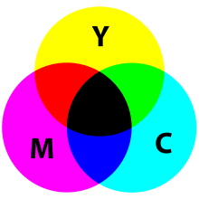
This is known as the CMYK system (Cyan, Magenta, Yellow and blacK). Figure 3 illustrates.
| Primary colours in printer ink | Cyan, Magenta, Yellow |
| Fourth colour ink commonly used in colour printers (the K in CMYK) | BlacK |
Scientists use the word 'pigment' to refer to the colour of things (including paint and printer ink) to distinguish it from light itself. For pigments, the primary colours are cyan, magenta and yellow.
If we look at Figure 3, we can see that red, which is the colour we get by mixing magenta and yellow pigments, is opposite cyan in the diagram. We say that red is the complementary colour of cyan – which is the same as saying that it's made up of the other two primary colours apart from cyan.
If you stare for a few seconds at a light (not too long, and not too bright a light, or you might damage your eyes) and then close your eyes, you'll see what's called a fatigue image on the insides of your eyelids. If the light is red, the fatigue image will be cyan; the fatigue image is the complementary colour to the light. Your eyes are compensating for the excess of red light by seeing green and blue – which together make cyan.
The colours that are supplied for use in printers – which we might call the primary colours for pigments – are the complementary colours of the three primary colours in light. We've already seen that cyan is the complementary colour of red; red is one of the primary colours for light, and cyan is one of the primary colours for pigments. Similary, magenta is the complementary colour of green, and blue is the complementary colour of yellow.
Complementary colours tend to look good in combination with each other, as fans of the Wimbledon Championships and Leeds Rhinos RLFC will testify. But as a West Bromwich Albion fan, I am not going to go into the delights of red and cyan – or, as it's commonly referred to in football circles, claret and blue.
So why are the primary colours for light different from those for pigments?
The reason is that the mixing of light is additive, while the mixing of pigments is subtractive.
For example: if you shine a red light on a white surface, the surface will look red. If you then add a green light to the red, the surface will look yellow.
With pigments, we have to remember that a printed page, or a painting, doesn't generate its own light; it reflects the light that shines on it. But only a white surface will reflect all the different colours in the same proportions. The reason that red paint (or anything else that's red, apart from a source of light) looks red is because it absorbs the green and blue light, and (if it's pure red) only the red gets reflected into your eye. The green and blue light has been subtracted from the mix. Similarly, pure blue paint absorbs all colours except blue; and yellow paint absorbs everything except yellow.
In practice however, it's not as simple as this. There's no such thing as paint of a pure colour; all paints reflect light in a range of colours. So (thinking of the colour wheel, in Figure 1) red paint reflects not only red light, but also a bit of orange and a bit of purple; while blue paint reflects, as well as blue, a bit of purple and a bit of green.
So if you mix red and blue paint, between them they absorb all the colours except purple; so all we see is purple.
The following table is my attempt to illustrate all this (in words), and to make it more memorable for quizzers.
The first and third columns show the three primary colours, in light and pigments respectively. Note that in each row, the colours in these two columns are complementary to each other. For example, blue (a primary colour in light) is complementary to yellow (a primary colour in pigments). The second and fourth columns show the two primary colours that you need in the other medium, to make the corresponding colours in the first and third columns.
For example: red is a primary colour in light, but to make it in pigments you need yellow and magenta. Similarly: magenta is a primary colour in pigments, but to make it in light you need red and blue.
| Primary (light) | Made from (in pigments) | Primary (pigments) | Made from (in light) |
| Red | Yellow, Magenta | Cyan | Green, Blue |
| Green | Yellow, Cyan | Magenta | Red, Blue |
| Blue | Cyan, Magenta | Yellow | Green, Red |
© Haydn Thompson 2017